Introduction


My name is Gabriel Meytanis (candidate number 8560). I completed Brief 1:Music Industry, working in Group 2 with Georgina Harper-Dennett (8720) and Phoebe Hung (8017). Our group photo can be seen on the right of the page. To access my portfolio evidence, please click on the labels to the right named A2 Research and Planning, A2 Construction and A2 Evaluation.


GiGi - Sit Still, Look Pretty (Group 2 Music Video)

Digipak

Digipak
The inside and outside panels of our Digipak
Please click the image above to access our website
Showing posts with label A2 Construction. Show all posts

Monday, 5 September 2016

Construction Post 6: Website post-production

My original website flat plan..
The final website's layout altered
slightly from our original thoughts.
Our final construction task was the website for our artist. This was the task which I was personally assigned to during the vast majority of the construction process, and I am glad as I believe I honed my creative and technical ability through my ideas and construction of the site.


To construct our site, we used online website creator Wix.com. I had never used Wix before, and I feel that I was able to take its numerous features, apps and widgets on board quickly, and was able to create a number of features for the site without any trouble at all. I really enjoyed learning about the site, as it was a new programme besides typically-used tools such as Adobe Photoshop and Premiere Pro, and allowed me to pick up lots new skills, as well as demonstrating my ability to transfer those new skills into a creative task, which I relished.


Using Wix:

Editing our site using Wix
Wix, overall, was a very helpful tool to use. Despite having to overcome certain problem such as...
-Occasionally it would lag
-Having to refresh the page if certain tools didn't work
-We weren't allowed to edit the site on different PCs at the same time

...the fact that we didn't have to know any potentially complicated methodology or code, and that it offered a huge array of different content, widgets and settings (the vast majority of which was accessed via the left-hand toolbar of an editing page) meant that it was a helpful tool on the whole.
The features of this toolbar are: (from top to bottom)

Our left-hand toolbar:
The toolbar offered a
huge varety of apps,
tools & settings.
-Background: Enabled us to change the background of not only a single page, but also of a number of pages at once - or all pages on the site. This background could be a colour, image or video.

-Add: Offers a huge range of features to add to the website: from preset templates of slideshows, photo galleries and email subscription, to hyperlinked buttons, images and texts.

-Wix App Market: Also offers a plethora of widgets, including a music player, embedded social media feed and an album tool with track list.

-My uploads: Enabled easy access to any content which we had uploaded to the site, including photos, music and fonts.

-Blog manager: The hub for our news page (which used the Wix blogger app), we could add and edit stories for the news section of the site, as well as 'pinning' any important news stories to the top of the list.

-Store manager: Once set up, this allowed us to create and manage a shop with several GiGi merchandise products. We were able to customise its layout, catalogue, price and product descriptions amongst other opportunities from here.

(Please click to
enlarge)
Our pages list
-Promote: (we did not use this section on our website, to promote it with by email)


Our site contained 25 individual pages overall (though most were linked to sections listed under the header - e.g Gallery; Tour), all of which were accessible via the pages list in the top-left corner of the Wix editor screen. Many were hidden (hence the icon of a crossed-out eye) from the header, such as the Privacy Policy and Terms & Conditions pages, which we realised were more conventionally placed on the footer. There was also the option (as was used on the Privacy Policy, due to its length and having followed convention such as on Selena Gomez' site) to hide the header and footer.

I have produced a breakdown of the main features whilst editing using Wix below:


Our website:

Having started relatively slowly, due to our original website design being scrapped and after the group roles were reshuffled (with myself being put in charge of constructing the website), we eventually began to make some very solid progress, and had laid the foundations for a number of pages. Our ideas behind the homepage, for instance, are listed below:
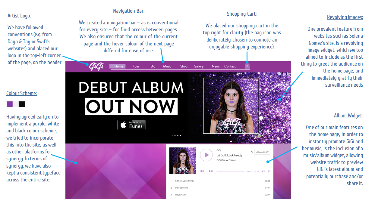
As our progress with the website continued, we took on a range of target audience feedback and gradually improved our numerous pages on the site. An example of this is our contact page:


Having received feedback from our target audience that said our page looked far too simplistic (albeit during the first few weeks of production), I implemented huge changes, adding a logo, Google Maps widget and extra information concerning the record company and their role. I also revamped the colour scheme to a purple and black gradient, which would continue across any official contact page, Ts & Cs and the privacy policy - (in other words, anything concerning our record label) to provide synergy with and match the brand colours of Glass Ceiling Records. (right)

Another example of how we changed our site is in the Gallery page. Whilst we originally inserted a carousel-style photo display on our gallery believing it would keep the page engaging, we changed this having completed our promo pictures, to incorporate our different photo categories:
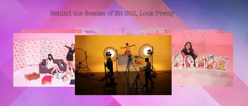
-SSLP: Behind The Scenes
-Official Photoshoot
-Social Media

(top) Our Polaroid-style pictures for a more interesting, retro aesthetic. Alternatively,
it could connote, again, a more human touch as though they were personal photographs.
(middle/bottom) Our original 'carousel-style' gallery vs our latest gallery with separate sections

Some of the family
photos which we used
on the Bio page of
the website.
In hindsight, this was a very necessary change, as our new page appears far more sleek and professional-looking, allowing for multiple photos - and for cross-media convergence, as our social media pictures are linked to GiGi's Instagram feed and promoted her across a range of platforms. Moreover I particularly like our new style, and the Polaroid-style captions are both visually interesting, and gives the website a human touch. This is reinforced through the series of home photographs, taking inspiration from Taylor Swift.

We used Taylor Swift's home video section as a reference point to
include some photos of GiGi when she was younger. This would
also increase GiGi's relatability and a more human side,

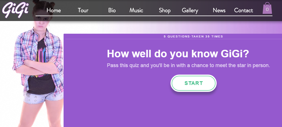
One possible disadvantage of using Wix was that many premium features had to be purchased after an initial free trial. I found this to be an obstacle which I had to overcome, as I had inserted a quiz originally on the Bio page, which unfortunately disappeared after being answered a certain amount of times. Fortunately, I was able to find a substitute online and embed this to work around a potential problem - which proved to be important to keep such a feature which could gratify the needs of the audience for interactivity on the site.

(left) Premium apps were a problem we had to work around
(right) Our final quiz. Below is an email box to enter a competition as part of the quiz.
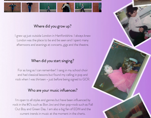
The bio page itself was something which we had worked on since the start of the project, and Georgina wrote information about herself in a question-and-answer format which we used, as it not only gives an insight into GiGi (surveillance gratification) away from the News page, but also was used on Little Mix's website, thus we took inspiration and believed it would be a very useful addition to our own sight.

(left) A snippet from our bio page...   (right)... the Q&A format was inspired by Little Mix's website

We also took inspiration from Little Mix's website for our quiz

Perhaps the most time-consuming aspect of the site, though arguably the most important - and most enjoyable when completed - was the range of purchasing opportunities available on the website. This ranged not only from several individual tour pages, with the opportunity to buy tickets for certain dates and locations (and a VIP link to Ticketmaster platinum), but also the vast catalogue of items which we made available on our website, from T-Shirts to iPhone cases, which we found were amongst a range of conventional products offered by current artists from Taylor Swift to Selena Gomez. These numerous purchasing opportunities not only added greatly to the authenticity and quality of our website (as confirmed from target audience feedback), but once more provided an important opportunity to engage the audience and incorporate interactivity.

Some of our purchasing opportunities on the site - from ticket sales to our merchandise shop.


We used a number of artist websites to both gain inspiration and follow convention. Our own product page, as well
as products such as our T-Shirt, Tour Poster & Hoodie were influenced by Taylor Swift's site.


Target audience feedback:

In order to receive feedback for the website, Georgina once again spoke to Biri, a member of our core target audience, who said the following:

Positives:

-The footer looked very realistic, and could convince someone due to its authenticity.
-Loved both how you could supposedly purchase tickets, and that the merchandise contained a small product description with details such as "no animal testing" (on our perfume, 'Eau de GiGi).
-Really liked the quiz, and how it and the competition adds an element of interactivity.
-Clear, continuous purple and white colour scheme and synergistic gradient.

Negatives/Improvements: 

-You couldn't go back a step to where you were: you have to go through different pages.
*This has since been resolved after snagging. For instance, the News and Gallery pages now have back buttons, whilst the 'change venue' link on the Tour page has been enlarged for clarity and ease of access.

Our secondary audience of younger pop fans were also surveyed, and gave their opinions:


Some of our more general feedback from our tertiary audience was:

-The website seemed authentic; convinced [her] that it was genuine.
-The addition of genuine logos and links (e.g Paypal, Twitter, Instagram) added to its authenticity.
-Liked that there were lots of widgets on the home page
-The landing page was clear, and the positioning of the video behind the overlay of the GiGi logo entices any web traffic into the site.
-They genuinely tried to purchase GiGi tickets.
-Acknowledged the synergy between GiGi's logo, the website background and the merchandise.
-Liked that the home photos from the Bio page gave the site a human element.
-Really enjoyed the quiz
-The revolving photo bar on the homepage is eye-catching.
-The website and its pages ("especially the gallery") were very fluid to navigate around.

 (Please click to enlarge) (left) Final website vs (right) Original/draft site
This is an example of our progress since snagging. We had already changed the
background and - after snagging - have enlarged the 'Change Venue' button for clearer, easier
access, and ensured that the PayPal button and link definitely works when accessed.

Our main teacher feedback when the site was snagged was:
-Some of the PayPal buttons did not work for certain tour pages.
*Resolved, as we re-configured every button to finally function properly - each with an individual link to a PayPal product with: GiGi Tickets - (location) - (date).

-Some sections of the website didn't have direct access back to the previous page.
*Resolved, as the News and Gallery pages now have buttons linking to the last page, and the 'change venue' button on the Tour page has been made far clearer for ease of use on the site.

The most major change, which luckily did not prove too much of an issue, was the change of our colour scheme and background towards the latter stages of construction. Having spoken to Phoebe, who did not like the selection of colours and (originally moving) background on the website at the time, we changed the backgrounds across the entire site - a move which was later welcomed by the target audience. Though this meant re-colouring and re-formatting every piece of content on the website, this paled in comparison to the importance of having a much better, visually interesting gradient background which still matches our colour scheme, and creates synergy across a range of our different media products.


(top) old website vs (bottom) new design & layout


Overall:

Looking back, I feel that all in all, we have created an excellent website, and it has both followed conventions of real sites where necessary for inspiration, as well as possessing a visual identity of its own, and numerous purchasing opportunities and embedded real-life content (such as PayPal, Twitter & Instagram) - which have enhanced its authenticity. Above all, it fulfils its promotional purpose and serves to gratify a range of audience gratifications.

Please click the above image to access our website
I am especially pleased that I have not only gained creative skills during the website's production, which I was ultimately assigned to, but also that I have had the opportunity to use a new tool and create a media product which, before now, we had not used; yet I feel our final product is of a very high standard and is certainly something we can be satisfied with.

Construction Post 5: Digipak post-production

The next of our three ancillary tasks is the digipak. The digipak was four-panelled, with two inside panels and two outside panels (made up of the front and back cover) - and was created using Adobe Photoshop. I think that our album was completed successfully overall, and that having tweaked our ideas slightly based on feedback, we have created a high-quality product.

Editing part of the digipak
Once again, having used Photoshop in previous projects, it was no issue to navigate around; and though Phoebe was the main group member assigned to work on the digipak, I was able to contribute to editing via Photoshop in places, as well as giving my ideas and input.

Process:


Our template when  editing our digipak via Photoshop.
During production of our album cover, we kept to strict dimensions (285mm x 125.5mm) and worked around a template:

The green area was for our main images and photos.
The blue outline was for text (only) to overlap into.
The red outline was the 'bleed line', and anything in this area would be cut off when the digipak was printed - so no important images or text were allowed to spill over into the red space.

Below I have included my breakdown of the main tools which we used:


Brightness/Contrast & Levels: Allowed us to alter how light or dark an image was, and how extreme the contrast between its highlights and shadows was. We could use this to adjust our focal image (or any other promo shot) if we thought it appeared pale. Similarly to Premiere Pro, we were also able to use levels to adjust an image's colour and the intensity of some shades.

 
We could made numerous visual adjustments to an image: especially using levels & brightness/contrast

Layer Style ( > gradient/colour overlay, drop shadow, etc.): Enabled us to make a number of additions and adjustments to an image in a particular layer. Proved particularly useful when editing the inside panels, as we applied a purple & green gradient overlay to a glitter background (which continued a visual motif from the front cover for synergy), and a drop shadow to the GiGi logo on the front cover, to enable it to better stand out against the background.

We could access 'layer
style' using the layer
tab. From there, we were
able to apply a number
of effects.
Refine edge had a number of scrollbars
and settings to edit the edge of an image.

Refine Edge: Proved to perhaps be the most useful feature when editing. Once we had selected (lassoed) around GiGi from a promo shot, we were able to hit 'refine edge' on the toolbar at the top of the page. From there, we were able to adjust the smoothness of the outline, shift its edge to crop or add to the lassoed image and also select to add a "new layer with layer mask" - useful, as this kept the original image in case we needed to restart refining its edge. This happened often, as when I used the magnetic lasso tool, it often attached to an unwanted part of the image, meaning I had to restart.

Though magnetic lasso was a good tool to use to cut around
part of an object, it occasionally proved problematic if it
attached to another part of the image.


Audience Feedback:

Similarly to the music video task, Georgina collected feedback (again from Biri, an example of a member of our core target audience). The opinions expressed were:

Positives:
-Glitter would appeal well to the young teenage segment of our audience,
-The consistent branding [synergy] of the GiGi logo
-The digipak looked realistic, thanks to conventional institutional information

Negatives/Improvements:
-The shade of purple was different to that of the website
-Multi-coloured font didn't work or match the character of GiGi (thus we changed this to different shades of purple instead)


Some further album feedback which we  received: (left) secondary audience feedback    (right) teacher feedback

We also received feedback from a general audience of music fans (tertiary audience feedback) who noted:

Changes to our track name colours:
an example of the feedback
we implemented
-Eye-catching purple colour theme. Noticed this continues across all three products
-Liked the shot variation between MCU and LS on our outside digipak panels
-Liked the shades of purple for the track listing
-Professional feel due to the institutional information, as it is a convention.
-Youthful look of the inside panel picture would appeal to the core target audience of female teenage and young adult fans of the pop genre.
-Nice continuation of the glitter theme; noticed Suffragette colours


Our digipak:

In hindsight, I would say it required more time than first thought to plan, construct and complete our digipak. This was mainly down to:
-retaking promo shots as original digipak shots didn't work
-rethinking and completely changing our original idea for the inside cover
-taking longer than expected to decide on the images we would use

The original album flat plan
Having booked another time-consuming shooting session, taken on board audience feedback (of no glitter on the face), re-shot our images and having taken completely different photos to what we originally planned for our inside cover, we altered this task a great deal.

Despite not being specifically delegated to get involved in the post-production of the digipak, I am glad that I not only added my input, ideas and feedback to Phoebe as she was editing, but also did in fact help with editing on Photoshop, as I enjoy using the programme and feel that many of my practical skills lie in using it in particular to create and edit products - albeit mainly when snagging our final album cover:

(above) Our pre-snagged digipak.

(above) Our digipak after snagging, with a distribution company (& information) 
and less of a white background outline around Georgina


The main changes between our pre-snagged image and our final digipak which I was responsible for were using the burn tool to attempt to get rid of part of the white background around GiGi on both the outside and inside panels, and advising Phoebe to add a distribution company (we chose RCA, a subsidiary of Sony Music Entertainment) as we found out it was conventional for indie labels like ours to use external distribution companies - which are often subsidiaries of the 'Big Three' - especially for pop artists.

Before our final snags and with us having decided that our original idea of GiGi running in a circle (to reflect female entrapment and lack of progress) hadn't worked at all, it was my idea to replace this with an image of GiGi supposedly signing her name across the album, as this would be a more personal image addressing the audience, and seemed to fit better aesthetically.


Final Product:

I am extremely pleased with the final result of our album. I feel particularly pleased that we have been able to incorporate a lot of synergistic features across not just the four digipak panels, but also between the album and our other promotion methods, such as our website, social media pages and video.
For instance:
-The 'GiGi' and 'Glass Ceiling Records' logos have remained the same, and have kept the same typefaces across all promotion platforms.
-A gradient theme has continued across a number of platforms, seen as a gradient in the logo, on the website & its merchandise, and social media pages.
-The visual motif of glitter continues from the front cover to the inside panels of the digipak.
-GiGi's main colour of purple is easily identifiable, and this has been seen across all of our ancillary tasks.
-The colour scheme of purple, white and green on the digipak's inside panels reflect those of the Suffragette movement, which in itself is a nod to GiGi's personal beliefs, and the underlying message of female empowerment in our music video for 'Sit, Still, Look Pretty'.

Below are our final digipak panels:


Overall, as I have mentioned, I am very happy with our final digipak. I believe that, once more, having incorporated a good amount of industry research, conventions and audience feedback (as well as, of course, our creative thinking and ideas) into our product, we have created a professional-looking product which could fulfil its purposes of clarifying the artist, signifying its genre and, overall, standing out to attract potential buyers. Meanwhile, I am personally happy to have been able to input creative and practical ideas, whilst briefly consolidating my Photoshop expertise.

Construction Post 4: Music video post-production

We have spent the last few weeks of post-production completing our various main & ancillary tasks - arguably the most important of which has been the music video. I believe that it has gone very successfully, and despite us having to overcome several issues and incorporate a range of feedback, I feel that we have done so and produced a video which can be judged as plausible and of a high standard.

Our Premiere Pro workspace. The dual-monitors of the edit suite allowed us to edit and
view the timeline on one screen, whilst observing the progress of our final video on the other.

We kept two main focuses in mind when creating & editing our music video:

-The first was to create a conceptual narrative story via our Dolls House Setup, which was a visual response to the music (thus incorporated Carol Vernallis' theory mentioned in The Kindest Cut) and conveyed a message of female empowerment.

-The second was to create a visually interesting sequence which continued this message and possessed numerous of unique references to a series of moments in the history of feminism and female roles. (This intertextuality could incorporate Andrew Goodwin's theory in Dancing in the Distraction Factory).

Ever since we finished shooting our music video, and throughout the various construction weeks that have followed, we have been editing our video using Adobe Premiere Pro: 


Having used Premiere Pro not just for the music video, rough cut and steal-o-matic, but also for a range of projects over the last 3 years, I had absolutely no problems cutting, editing and grading shots; though I do feel that I have used new tools and effects, which have allowed me to consolidate and add to my post-production skills. The tools which I used are listed below:

-Render:
Whilst not being a tool as such, it was certainly absolutely vital to the progress of our project, as it confirmed and loaded any effects or changes to our shots so that we could play the video back in normal time. As a result, we could see what the exported version of our video would look like. (Please click the image to enlarge)
-Speed/Duration:
This was particularly useful to our sequence, as we were able to slow down footage which we had captured at 60fps to achieve a smooth slow-motion effect to add a 'big finish' to our Dolls House narrative. There was also the option to reverse shots, or speed the footage up (Please click the image to enlarge)
I have also listed a number of benefits of using the program to edit below:


Using effects:
(please click to enlarge)
Adjusting the RGB curves of
a shot. This enabled us to alter
the intensity of certain colours.
-Grading techniques:
This was an area in which I felt I definitely widened my skills. Having only used ProcAmp and the three-way colour corrector to grade before this project, it was a learning curve using levels and RGB curves to enhance the visuals of our footage. Whilst I didn't personally get to colour grade, I discussed and picked up the technique from Phoebe as she used it during colour grading.

Editing with Phoebe.

ProcAmp was used, as always, to adjust our footage's brightness, contrast, hue and saturation. Meanwhile, we were able to use both levels and RGB curves to enhance certain colours and increase the saturation of certain shots. This would prove to be hugely beneficial, as we encountered an issue that, despite re-shooting with less intense light, the Snow White setup's lighting illuminated Georgina in red. Using levels, we were able to toggle how intense the shade of red was in our footage, and thus reduce the effect of the red lighting on that setup.

(left) Adjusting levels     (right) after grading, on the left  vs   intense red lighting before
Grading, all in all, was hugely important to us, and helped to establish a particular aesthetic. In our case, besides correcting lighting issues from the Snow White setup, our choice to enhance colours using levels, as well as increasing saturation and brightness for a number of shots - particularly Dolls House shots - was a deliberate choice to easily connote a music video from the pop genre.

(left) Another good example of the benefit of RGB curves was in the puppet setup, where we
enhanced blues and greens to connote a 'colder' aesthetic. (left = after    vs    right = before)
(right) Using ProcAmp to enhance brightness and saturation.

-Video effects:
We also used a number of video effects under the 'motion' tab to change the position, scale and dimensions of shots. For instance, we increased the scale of some shots if we hadn't framed GiGi tightly enough, and to act as a zoom - though we had to be careful that the image quality didn't suffer too much. Meanwhile, we tilted other shots, such as some in the Dolls House, by -0.5°, to try and edit them to appear absolutely flat, as some shots seemed slanted.

 
(left) Using video effects to enlarge/zoom one of our rushes
(centre) The cross-dissolve. We placed it across two shots to fade into each other
(right) How we accessed the cross dissolve video transition

As well as this, we were able to use video transitions to enhance our sequence. Besides using a dip to black at the end of the timeline to follow the conventions of a number of existing videos, we tried using a cross-dissolve to merge some of our setups and add an aesthetically pleasing & interesting conclusion to our music video:


Feedback:


Some of the feedback our group
received from our media
technician and teacher.
We received a huge amount of feedback relating to our video throughout post-production. Georgina conducted lots of audience feedback, which has been displayed below:

-One of the most important during construction was with Biri, a member of our core target audience (as a 17 year-old female pop music fan) who said the following:

Positives:
-GiGi's continued purple colour scheme, and the vibrant colours in each setup.
-The patriarchal figure in the video represented by the male doll
-"Looked like a Meghan Trainor video": this is a huge positive for us, as it was one of our main reference points for content and aesthetic style.
-Georgina's characterisation, gesture and facial expressions.


(please click to enlarge)
Some further audience feedback
with Sofia: a 12-year old female
fan of the pop genre.
Negatives/Improvements:
-How she got into the Doll's House was unclear. Thus, we changed the shot order of the narrative sequence.
-Shots were often in large blocks, and there was enough shot variation for the various setups. As a result, we increased the amount of intercutting in the video, using more of the doll's house and performance setups to drive the narrative.

I also felt that the ending of the narrative sequence was slightly awkward, thus we also changed the ending of the doll's house sequence to make what unfolds clearer.
I have produced a snippet of our original narrative ending here:


Moreover, we also received feedback from our teachers and media technician - and myself and Phoebe completed any snagging needed, such as ensuring the lipsync was exactly in time.
As well as tailoring our video to the audience, we also had to face and overcome a number of problems with our edit, which I have listed below:


Overall:

On the whole I would say I am pretty pleased with how our video has turned out, and I believe that the hard work we all put in - whether it was editing, researching or inputting ideas - has resulted in a high-standard music video which incorporates theory and conventions very well. Whilst there are still some small issues which cannot be resolved, such as a lack of focus in some shots, and some lighting issues which cannot fully be ironed out, I think that it is still a product of our hard grafting over the last few weeks, and is a finished product we can be proud of, as has been reflected in a great deal of target audience feedback...