 |
| We looked at a number of promo shots on album covers. |
-Keep a synergistic visual motif running through
-Colour Scheme: Black, Purple, Silver
-Keep synergy/relation with the video but not too many similarities
-Connote the genre, personality and style of the artist
Myself and Phoebe took a series of promo shots, and we aimed to have Georgina in a variety of poses, and with different makeup and costume in each, as this is conventional.
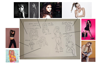
We also used existing promo shots, alongside Phoebe's notes and references, to help us plan our promo shots:
I think that having researched into existing promo shots, I have gained knowledge on the roles, forms and conventions of promo shots, and that they are predominantly used across the website, digipak and social media. Hopefully, we can further this information, and use it to produce some good promo shots.


No comments:
Post a Comment